What does luxury mean, online?
Here are some thoughts and ideas to define digital luxury, taking cues from what luxury means in everyday life.
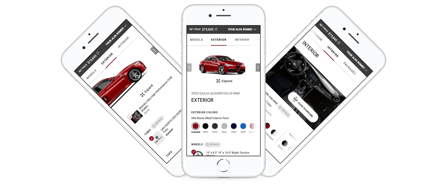
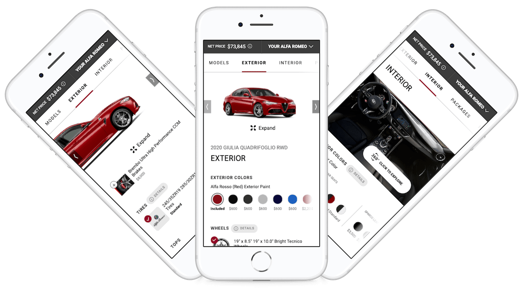
Bringing the user into the main section of this application is done in 2 steps. The first is a cinematic vehicle selection page and the second is a grid view of the vehicle trims (models), thus increasing the difficulty and amount of options slowly, before getting to the main part of the configurator.

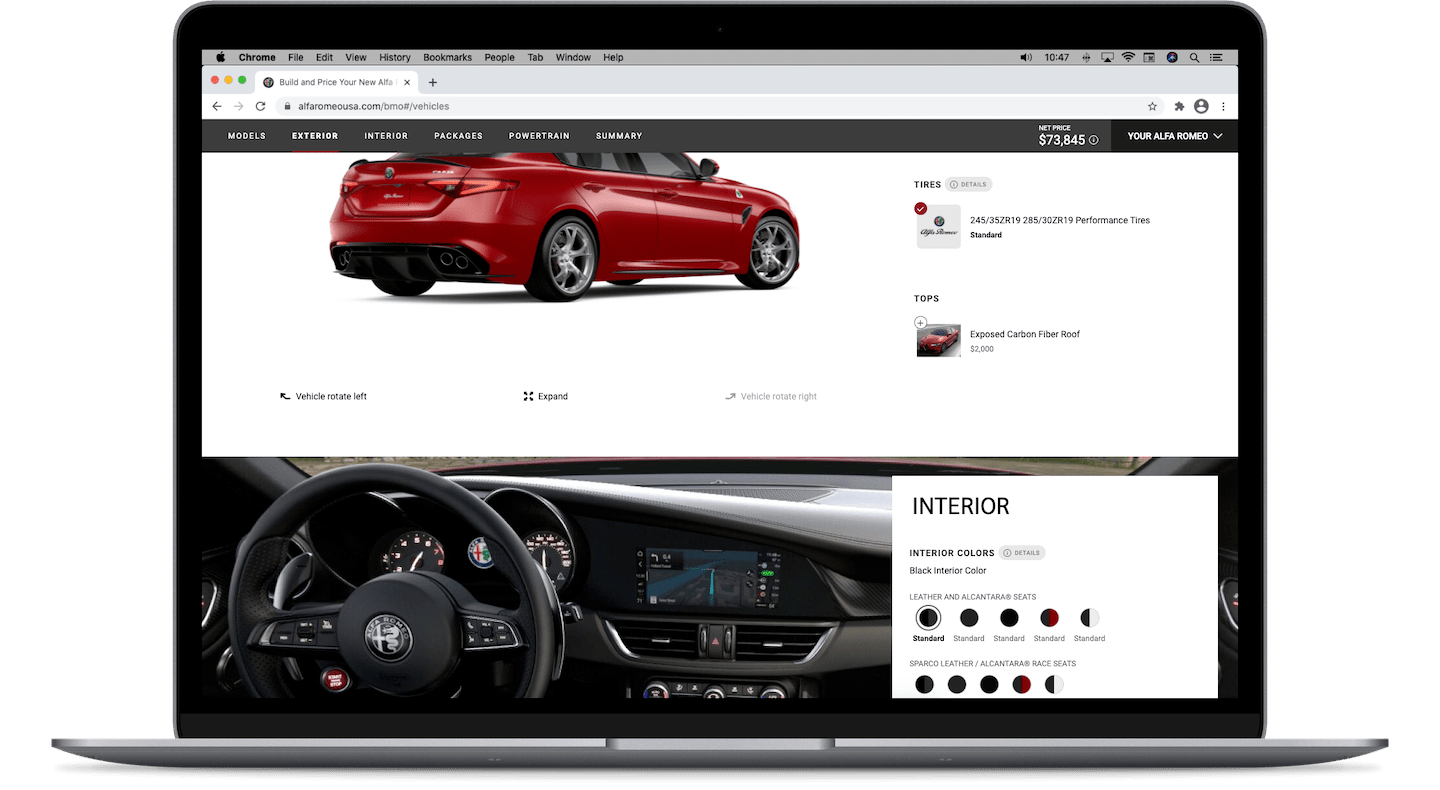
To achieve fast load times (and fast perceived load times), this application uses: lazy loading for images and sections of the page, as well as a re-organized dynamic data feed, which shows contextual options together. For example, some Exterior options were part of Packages before, but were moved to the Exterior section so that you can compare/contrast/try all exterior options in the exterior section.
The way in which the application is laid out on desktop, tablet and mobile viewports makes it easy to orient yourself quickly. Within a single scroll, it's evident that the left side is dedicated to the product and the right to the feed of selectors (on Desktop). On mobile this same split is done vertically instead. Deciding on this layout mechanism was in my opinion one of the most important parts of the project.
By using a single page design (with alternating layouts in each section) this application can provide exciting moments with highly engaging content, and quieter moments with content that's made to be read or analysed. It's easy to find yourself at the bottom of the page having completed a build without a lot of effort.

Animation can often be overused, so it's used sparingly here, which maximizes its impact. For example, sections of the data feed fade-in, selectors animate when switching states (on/off), and notifications slide up from the bottom.
All this to get your attention at the right time or to provide a confirmation of your input.
These vehicles and add-ons can be quite expensive, so it's safe to assume that there will be plenty of users that will relish the notion of learning every possible detail and option on a single vehicle. To support keen power users, detailed information is available and located conveniently. The 'Details' pill is de-prioritized visually, since it's not primary content, but when selected it opens a modal that displays all kinds of detailed and technical information. It also has an easy cross-navigation for related options.

All the steps and sections are found on 1 single page. That being said, they all look different, in order to keep things exciting, but also to encourage people to focus on a specific section or type of content.
While building a vehicle, users will likely want to compare options visually, so the images update with every single selection. This type of fun interaction requires a lot of "calls" to the media server, but with the right tech infrastructure this can be done, and in turn users get a delightful moment on click/tap. Additionally, images can also be expanded or rotated where applicable and an editorial-styled Summary section allows for a stylish review of the configuration.
Some users like to analyse each option while others want a quick preview of what they can get. Scrolling through the page is inherently progressing through the build, so users have fast access to the end result.
In other words the application isn't standing in the way of them getting the luxury item they're exploring, it's enabling them in their research.
The dynamic feed of options was re-organized to display contextual options together, so that users don't have to scroll around looking for Exterior finishes outside of the Exterior section, for example.

Circles are for colours, pills are for details, mini tiles are for thumbnails, tiles are for packages, and rectangles are for buttons. Each function has a dedicated shape, purpose and behaviour.
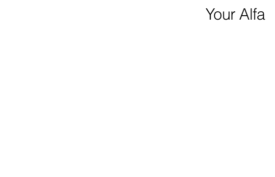
Some users may want to get a glimpse of their financial options, as they progress down the page. To accomodate for that, the 'Your Alfa Romeo' button opens a stylized drawer with that information. Additionally, every time a new selection is made, the price updates in the finances preview section, just left of the vehicle drawer.
At the start of the project, one of the first things I did was to categorize conflicts. Aiming to either remove them or simplify them.
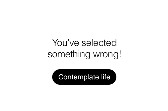
A "conflict" usually occurs when a new selection doesn't match the series of previous selections. This can be a result of business or engineering decisions
Build & Price configurators are usually plagued with these types of issues, displaying alerts almost every step of the way, creating very jarring experiences. Many still have those problems.
In this case, half of them were removed and the other half re-thought from the ground up.
Users don't particularly care that one selection doesn't match with another in the back end. All they want is to configure a product and preview options.
If your configuration tool still displays warnings you are not doing enough to reduce friction, and you're creating confusion when you don't need to. Consider re-organizing your data feed and removing obstacles.
For example, selecting a colour should display it no matter the price or package that it belongs to.
Selecting a bigger wheel size can automatically update the tire size, they're directly related so there's no need to say that they don't match, just update it. You can display a note that lets users undo a selection, which can disappear after a few seconds.
In the event that you have a grouped set of selectors, you can display a non-intrusive, step-by-step flow, making sure that the purpose of each option and its benefit to the user are clearly defined.
Additionally, the language used when displaying notifications should be easy to understand. Appropriately friendly language can be understood faster than legal or engineering style of language. Keep that in mind.
Simplicity is hard to achieve, until you organize the complicated stuff.
The both very talented Saamia Meghji and Melanie Wong are to thank for how amazing this application looks; thanks to Cole Wheeler for many days of banter, ideation and spreadsheets; finally, thank you to Mirza Saković, Phil Bonnell, Boris Stojanović and Ryan McCarthy for the trust they had in me.
Bringing the user into the main section of this application is done in 2 steps. The first is a cinematic vehicle selection page and the second is a grid view of the vehicle trims (models), thus increasing the difficulty and amount of options slowly, before getting to the main part of the configurator.
To achieve fast load times (and fast perceived load times), this application uses: lazy loading for images and sections of the page, as well as a re-organized dynamic data feed, which shows contextual options together. For example, some Exterior options were part of Packages before, but were moved to the Exterior section so that you can compare/contrast/try all exterior options in the exterior section.
The way in which the application is laid out on desktop, tablet and mobile viewports makes it easy to orient yourself quickly. Within a single scroll, it's evident that the left side is dedicated to the product and the right to the feed of selectors (on Desktop). On mobile this same split is done vertically instead. Deciding on this layout mechanism was in my opinion one of the most important parts of the project.
By using a single page design (with alternating layouts in each section) this application can provide exciting moments with highly engaging content, and quieter moments with content that's made to be read or analysed. It's easy to find yourself at the bottom of the page having completed a build without a lot of effort.
Animation can often be overused, so it's used sparingly here, which maximizes its impact. For example, sections of the data feed fade-in, selectors animate when switching states (on/off), and notifications slide up from the bottom.
All this to get your attention at the right time or to provide a confirmation of your input.
These vehicles and add-ons can be quite expensive, so it's safe to assume that there will be plenty of users that will relish the notion of learning every possible detail and option on a single vehicle. To support keen power users, detailed information is available and located conveniently. The 'Details' pill is de-prioritized visually, since it's not primary content, but when selected it opens a modal that displays all kinds of detailed and technical information. It also has an easy cross-navigation for related options.
All the steps and sections are found on 1 single page. That being said, they all look different, in order to keep things exciting, but also to encourage people to focus on a specific section or type of content.
While building a vehicle, users will likely want to compare options visually, so the images update with every single selection. This type of fun interaction requires a lot of "calls" to the media server, but with the right tech infrastructure this can be done, and in turn users get a delightful moment on click/tap. Additionally, images can also be expanded or rotated where applicable and an editorial-styled Summary section allows for a stylish review of the configuration.
Some users like to analyse each option while others want a quick preview of what they can get. Scrolling through the page is inherently progressing through the build, so users have fast access to the end result.
In other words the application isn't standing in the way of them getting the luxury item they're exploring, it's enabling them in their research.
The dynamic feed of options was re-organized to display contextual options together, so that users don't have to scroll around looking for Exterior finishes outside of the Exterior section, for example.
Circles are for colours, pills are for details, mini tiles are for thumbnails, tiles are for packages, and rectangles are for buttons. Each function has a dedicated shape, purpose and behaviour.
Some users may want to get a glimpse of their financial options, as they progress down the page. To accomodate for that, the 'Your Alfa Romeo' button opens a stylized drawer with that information. Additionally, every time a new selection is made, the price updates in the finances preview section, just left of the vehicle drawer.
At the start of the project, one of the first things I did was to categorize conflicts. Aiming to either remove them or simplify them.
A "conflict" usually occurs when a new selection doesn't match the series of previous selections. This can be a result of business or engineering decisions
Build & Price configurators are usually plagued with these types of issues, displaying alerts almost every step of the way, creating very jarring experiences. Many still have those problems.
In this case, half of them were removed and the other half re-thought from the ground up.
Users don't particularly care that one selection doesn't match with another in the back end. All they want is to configure a product and preview options.
If your configuration tool still displays warnings you are not doing enough to reduce friction, and you're creating confusion when you don't need to. Consider re-organizing your data feed and removing obstacles.
For example, selecting a colour should display it no matter the price or package that it belongs to.
Selecting a bigger wheel size can automatically update the tire size, they're directly related so there's no need to say that they don't match, just update it. You can display a note that lets users undo a selection, which can disappear after a few seconds.
In the event that you have a grouped set of selectors, you can display a non-intrusive, step-by-step flow, making sure that the purpose of each option and its benefit to the user are clearly defined.
Additionally, the language used when displaying notifications should be easy to understand. Appropriately friendly language can be understood faster than legal or engineering style of language. Keep that in mind.
Simplicity is hard to achieve, until you organize the complicated stuff.
The both very talented Saamia Meghji and Melanie Wong are to thank for how amazing this application looks; thanks to Cole Wheeler for many days of banter, ideation and spreadsheets; finally, thank you to Mirza Saković, Phil Bonnell, Boris Stojanović and Ryan McCarthy for the trust they had in me.
Speed, delight, ease of use and lack of conflicts are real life luxuries too.
We need to design apps that are grounded in reality for them to feel intuitive.