I came close to driving an Alfa a couple years ago...
...however the rental shop didn't have any left when I got there, so I settled for an Audi A4 Wagon, which mind you, grips the asphalt like you wouldn't believe.
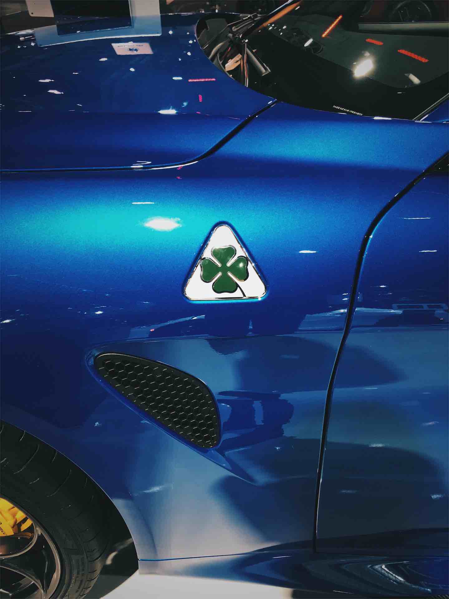
Anyway...I had this idea to fly to Milan, rent a penthouse with a balcony, drive an Alfa and pretend to be Italian for a summer (...live a little). I was also looking forward to working on this project as you don't often get the chance to design something that wears the four-leaf clover insigne.
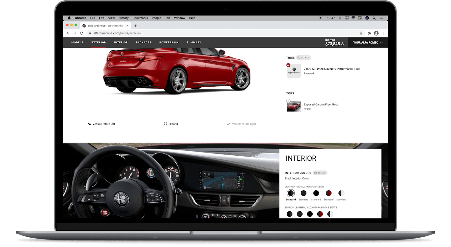
One afternoon, I prototyped what is now the Cinematic Hero component while sipping amaro Lucano. A visit to the Fiat plant nearby was in the plans, but instead I drove to see friends in Geneva. You could say it was a great trip.
I'd like to thank Graham Ameron for the creative jams and guidance, and Dave Jackson for his openness and collaboration.
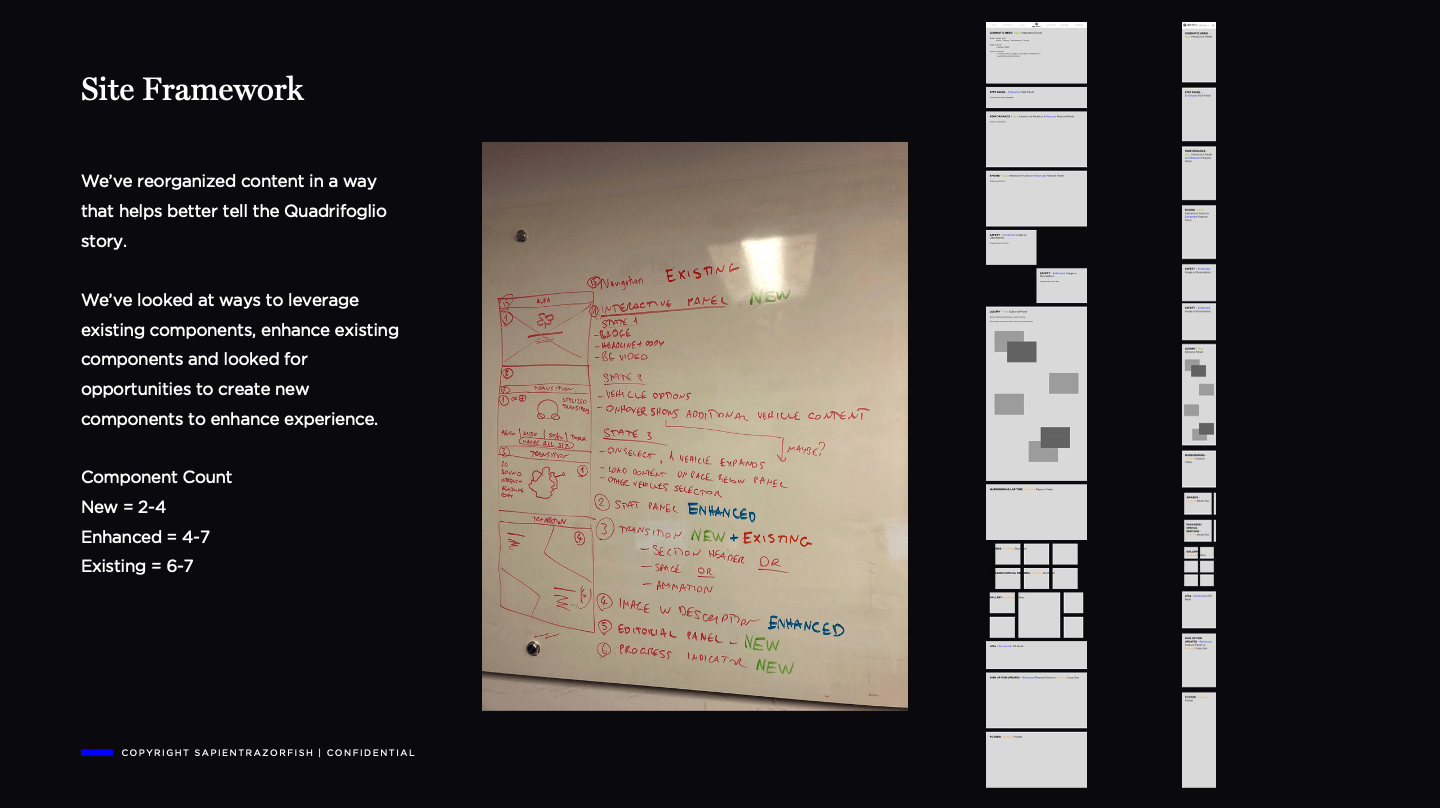
Below, is a recollection of the decisions I've made while building the experience strategy and design system for Quadrifoglio, the performance branch of Alfa Romeo 🍀
...however the rental shop didn't have any left when I got there, so I settled for an Audi A4 Wagon, which mind you, grips the asphalt like you wouldn't believe.
Anyway...I had this idea to fly to Milan, rent a penthouse with a balcony, drive an Alfa and pretend to be Italian for a summer (...live a little). I was also looking forward to working on this project as you don't often get the chance to design something that wears the four-leaf clover insigne.
One afternoon, I prototyped what is now the Cinematic Hero component while sipping amaro Lucano. A visit to the Fiat plant nearby was in the plans, but instead I drove to see friends in Geneva. You could say it was a great trip.
I'd like to thank Graham Ameron for the creative jams and guidance, and Dave Jackson for his openness and collaboration.
Below, is a recollection of the decisions I've made while building the experience strategy and design system for Quadrifoglio, the performance branch of Alfa Romeo 🍀