Exploring vehicles inside and out with Augmented Reality ↴
Can AR actually be useful?
Though we might not read manuals anymore before using products, we expect to be able to figure things out without too much trouble — and when we need some help, we refer to the booklet that came with the product or we find answers with a quick search online.
The ultimate goal with this app was to try to make something that's actually useful. Ideally, it would be an interaction that's faster than looking through a book and more direct than an Internet search. It would also test the strengths and the purpose of AR.
There's also a chance to define new UX patterns (as well as UI) since AR is still in its infancy, relatively speaking. It can often be gimmicky or feel surreal, so whoever finds a real-life use for AR will inevitably change things for the technology.
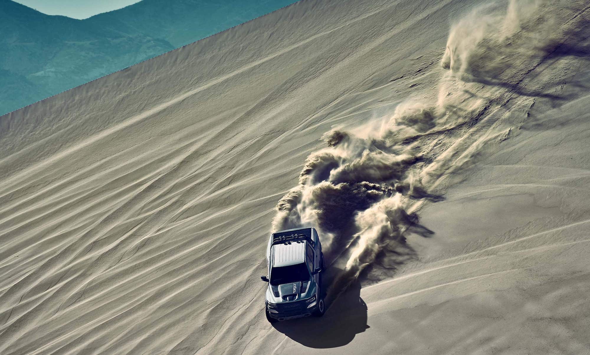
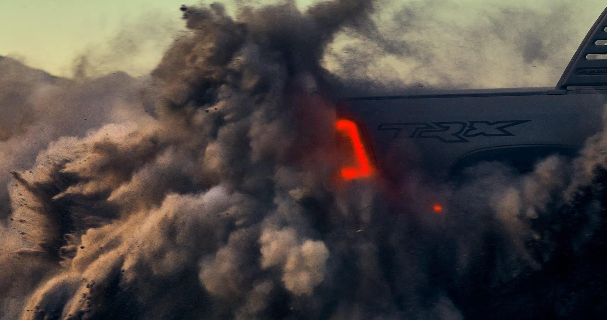
The vehicle in the shot above, the brand new TRX, created a lot of hype in the community. That being said, for the duration of the project this vehicle was not only under embargo, but the CANADA/US borders were completely closed (2020-2021), which meant that half of our process had to switch to digital alternatives.
Most notably, Mural allowed us to get as close as possible to a real-life discussion and workshop. We had different areas on the presentation board, each facilitating discussion around different types of problems, with varing ways to engage the participants. It really helped.
In an effort to make something better, it's important to ground the experience goals in reality. In what people actually expect, what they're annoyed with, what they just can't seem to care for. Being real with the fact that most people still don't use AR, meant that this implementation needs to be fast and intuitive.
Though we might not read manuals anymore before using products, we expect to be able to figure things out without too much trouble — and when we need some help, we refer to the booklet that came with the product or we find answers with a quick search online.
The ultimate goal with this app was to try to make something that's actually useful. Ideally, it would be an interaction that's faster than looking through a book and more direct than an Internet search. It would also test the strengths and the purpose of AR.
There's also a chance to define new UX patterns (as well as UI) since AR is still in its infancy, relatively speaking. It can often be gimmicky or feel surreal, so whoever finds a real-life use for AR will inevitably change things for the technology.
The vehicle in the shot above, the brand new TRX, created a lot of hype in the community. That being said, for the duration of the project this vehicle was not only under embargo, but the CANADA/US borders were completely closed (2020-2021), which meant that half of our process had to switch to digital alternatives.
Most notably, Mural allowed us to get as close as possible to a real-life discussion and workshop. We had different areas on the presentation board, each facilitating discussion around different types of problems, with varing ways to engage the participants. It really helped.
In an effort to make something better, it's important to ground the experience goals in reality. In what people actually expect, what they're annoyed with, what they just can't seem to care for. Being real with the fact that most people still don't use AR, meant that this implementation needs to be fast and intuitive.
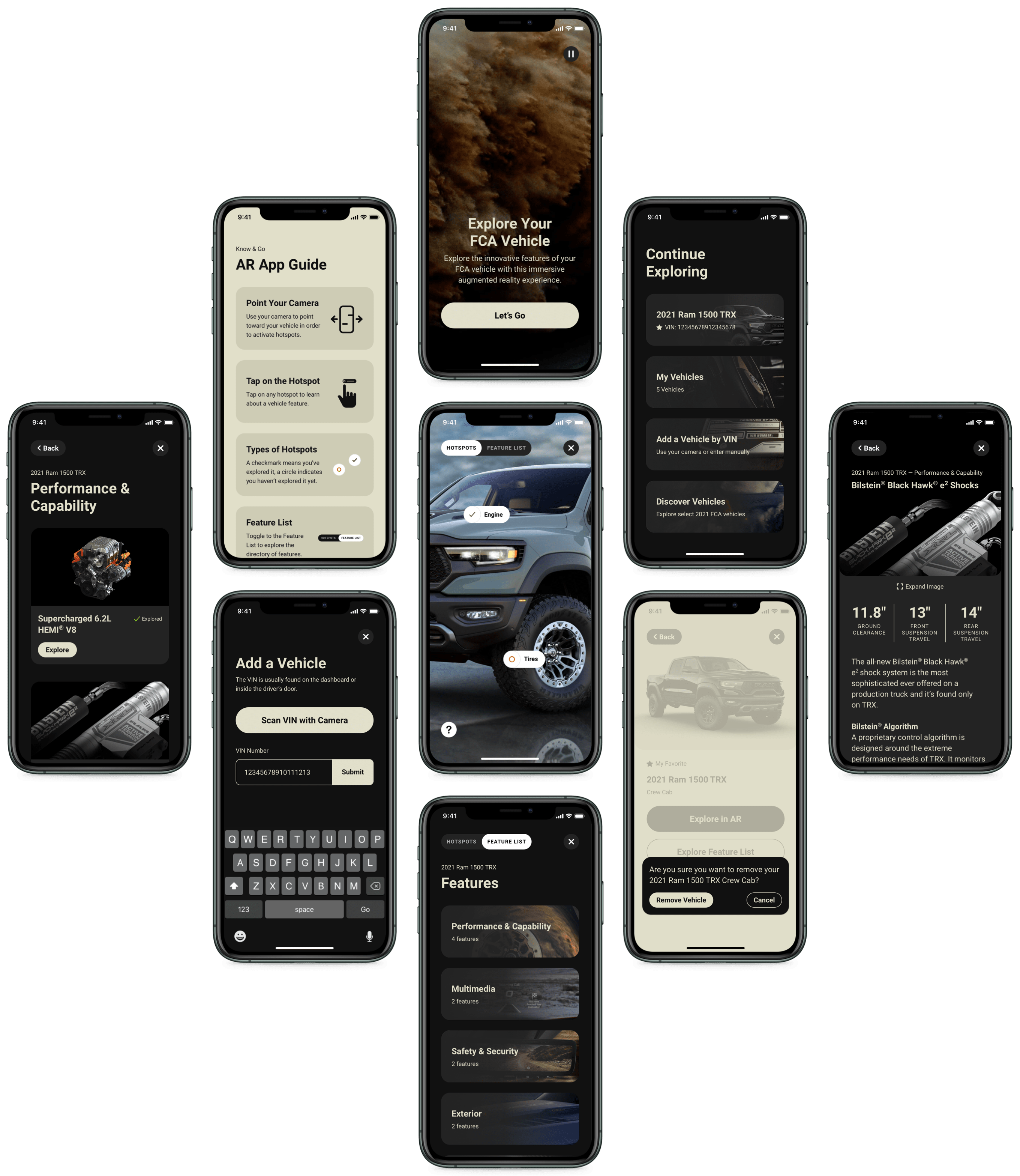
There aren't too many AR apps on the market, so there are very few established conventions that people are familiar with. Because of that, we took cues from a variety of commonly used, camera related apps.
What's notable with apps whose primary function is taking photos or videos, is that they invite users to participate by opening the camera right away.
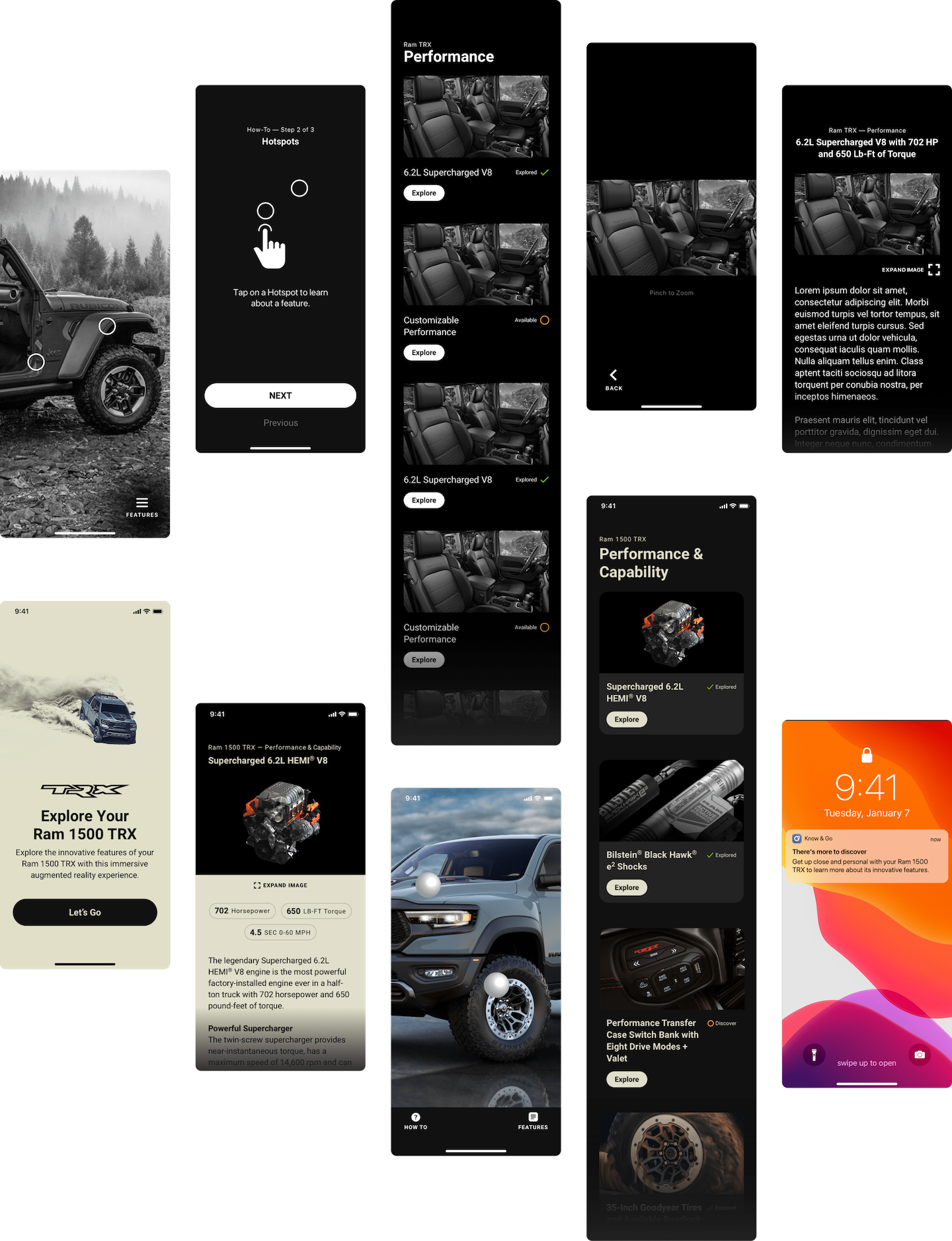
And since AR was the primary focus, my recommendation was to make the automatic camera feed the focal point of the app, making it the homepage screen.
Because AR is new to a lot of people, making the first step barrier-free is very important. Using conventions that people are familiar with will get them through the door much quicker, which then gives you time to gradually teach new user interfaces or ways to navigate to content.
There aren't too many AR apps on the market, so there are very few established conventions that people are familiar with. Because of that, we took cues from a variety of commonly used, camera related apps.
What's notable with apps whose primary function is taking photos or videos, is that they invite users to participate by opening the camera right away.
And since AR was the primary focus, my recommendation was to make the automatic camera feed the focal point of the app, making it the homepage screen.
Because AR is new to a lot of people, making the first step barrier-free is very important. Using conventions that people are familiar with will get them through the door much quicker, which then gives you time to gradually teach new user interfaces or ways to navigate to content.
After the first release, there's a number of things we were able to learn through testing and user feedback.
This informed our decisions for v2.0 which was going to have a much more structured release cycle, a long-term plan for feature development and a release schedule, not to mention an evolved design language with greater flexibility.
The app also had to meet WCAG AA standards for accessibility, which is the reason we now have a landscape mode, among other things.
In an effort to make the design future-proof, I restructured the app's architecture which will allow for easier access to a number of new features that are being added (or will be added in subsequent releases).
Creating an app with "no navigation" means that every content section is within a single step from the home page. This also allowed us to have floating UI elements that make the AR experience feel more immersive, in portrait but especially in landscape mode.
Finally, thank you to the talented CJ Flynn for turning these ideas into a visually stunning app, to Vishal Mittal, Nancy Gandhi, Rahul Kumar and the rest of the team for never giving up in doing the right thing.